Back in November, 2013, I gave a presentation at the University of Oregon titled, “VERSUS: Exploring Opposites and Choosing Sides in the Interactive Industry.” This is the second in a series of five posts, taking the presentation and parsing it out in blog format.
Missed Part 1?
“A brand is a person’s gut feeling about a product, service or organization.”
– Marty Neumeier, The Brand Gap
What is brand? I’ve written previously about what I think “Interaction Is Brand” means, but before we get into that, let’s think about brand from a more general perspective. Take this commercial from circa 2002…
Then compare it to the VERY SAME AD VIDEO, only with different audio.
As far as I’m aware, both of these versions of the ad were released (one isn’t a “user generated” edit). These two commercials have fascinated me for years… which one is “right” for the brand? Are they both right, just different? It’s an example of defining a brand where there might not be a right and a wrong, but one might be more appropriate for whatever brand message Gap was trying to convey. They each certainly convey a different feeling.
Another interesting aspect of this commercial is that it is selling “brand” over product. No matter how revolutionary or different your product is, at some point you’re going to have competitors selling a similar product. And if you focus on product over brand, you move from selling a brand to selling a commodity.
[callout img=”/wp-content/uploads/2013/12/pie-chart-white.jpg”]
This pie chart represents 2012 Outdoor Apparel Sales in the United States. The leading brand sold 33.5% of all outdoor apparel in the U.S. last year. The next closest brand sold 12.5% of all outdoor apparel. The remaining 54% is divided up among many other brands.
(These stats are quoted on The New York Times website) via SportsOneSource, a market research firm. This number refers only to apparel like fleeces, jackets, vests, pants and hats, not to backpacks and other gear — and only to products sold by sporting goods retailers like Dick’s Sporting Goods and REI.)
[/callout]
Based on the concept of brand over product, check out the two commercials* below. One of these commercials is by the brand owning 33.5% of sales, the other is 12.5% of sales. * NOTE: Since giving this presentation, the commercial for Columbia has been taken down from YouTube
Can you guess which brand was 33.5% of sales and which was 12.5% of sales?

My hypothesis, which has absolutely no data to back it up, is that the reason The North Face has 20% higher sales than Columbia is because The North Face is selling brand; Columbia is selling product. (Full disclaimer: The North Face is a Substance client, though we had nothing to do with the above commercial.)
Now that we’ve gone off on this tangent of brand from a commercial standpoint, let’s bring it back to Interaction Is Brand…
What has changed are the channels in which this “gut feeling” is influenced and affected (with channels meaning more digital – primarily online and apps). How a web site looks, responds, functions, navigates, loads, and even the 404 page is part of the brand.
What is interaction is brand? The feeling you get from visiting a website.
 So how do you know when the brand you’re developing – interactive or otherwise – is “right”? Self-criticism is probably the most important characteristic we can have as designers and creative people. It’s easy to criticize other peoples’ work; it’s much more challenging to honestly evaluate your own.
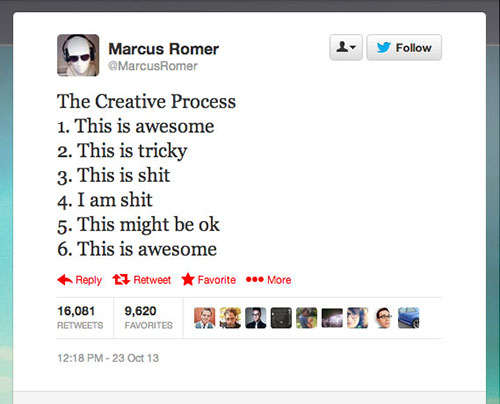 Coincidentally, a couple days after I posted about my self-doubt, someone I know retweeted a tweet by Marcus Romer (who I don’t know), effectively summarizing the entire creative process I was going through. Thinking about it a bit more, I realized a few things.
REALIZATION ONE: If we don’t question what we’re doing, how can we ever make it better?
REALIZATION TWO: There will always be another way of solving a problem; our job is to determine which is the most appropriate solution at the time we’re solving it. It may not be the “best” solution, but it’s better to move forward with A solution than NO solution.
REALIZATION THREE: Sometimes when you start, you don’t know a solution isn’t going to be the right solution. But until you take that first step, or even that second or third step, it’s not obvious what isn’t going to work. There are plenty of times where I’ve done a sketch and thought, “this is going to be great,” only to start actually laying it out and realizing, “this is terrible.” But I wouldn’t have known had I not taken that second step from sketch to design.
REALIZATION FOUR: No matter how long you work in this industry, if you think you know all the answers, you’re wrong. Stay humble.
REALIZATION FIVE: Even when being self-critical, sometimes you need another brain to help solve a problem. Be open to feedback from others. Listen to what they’re saying. It doesn’t mean they’re always right, but sometimes another perspective can help you frame the problem in a different way.
Ultimately, I realized what frustrated me the most in the project that prompted my self-doubt was that I had done the expected design solution. It was fine, but it wasn’t great. And that’s where the self-criticism comes into play. If I hadn’t done that design solution first, I wouldn’t have realized what was wrong with it. Design can be a trial-and-error process, and sometimes you just have to keep moving forward with a solution, even if you feel like it isn’t going to be right in the end. From that initial design, I rethought the page elements, exaggerated the content hierarchy, and put in the time to try many, many different options. It was at that point that I was able to move to Steps 5 and 6 from Marcus’s list.
One way we try to move through Marcus’s six steps more efficiently (because there’s no absolute shortcut to get from Step 1 to Step 6 without experiencing some of the intermediate steps), or at least determine a general direction, is to create a Statement of Intent.
How do we determine the feeling?
Statement of Intent
“Commander’s Intent empowers initiative, improvisation, and adaptation by providing guidance of what a successful conclusion looks like.”
This is a statement that clearly outlines what the site is intended to do, and serves as a benchmark for all decisions moving forward during strategy, design, and development. It speaks to the overall brand and primary goal of a website, and all design elements, functional pieces, and content types should answer and reinforce the Statement of Intent. The idea for the Statement of Intent is based on the concept of Commander’s Intent. “Commander’s Intent is the description and definition of what a successful mission will look like. It shows what success looks like.” We use this idea to state why a website should exist. If something we architect, design, or develop doesn’t directly answer the Statement of Intent, we must question if it is necessary. The Statement of Intent, just like the Commander’s Intent, gives us the freedom to improvise and adapt, while keeping the main objective at the forefront.
The other key aspect of the Statement of Intent is it doesn’t focus on a banal idea like, “sell more jackets,” but on an emotional goal like, “inspire adventure.” Emotion over commodity, always.

This is the second in a series of five posts based on a presentation given in November 2013 at the University of Oregon titled, “VERSUS: Exploring Opposites and Choosing Sides in the Interactive Industry.”
Part 1
Leave a Reply